In this article, you’ll see how to annotate your Google charts, by adding formatting and data labels to specific data points only.
Formatting specific datapoints or adding data labels are a very powerful way of adding context to your charts, to bring attention to certain data points and add additional explanation.
How to add formatting to individual data points only?
Custom formatting for individual points is available through the chart sidebar: Chart Editor > CUSTOMIZE > Series > FORMAT DATA POINTS
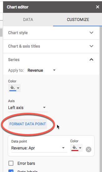
When you click on the FORMAT DATA POINT button, you’re prompted to choose which data point you want to format (what you see here will depend on your chart):
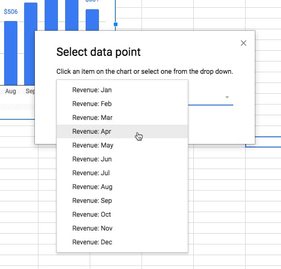
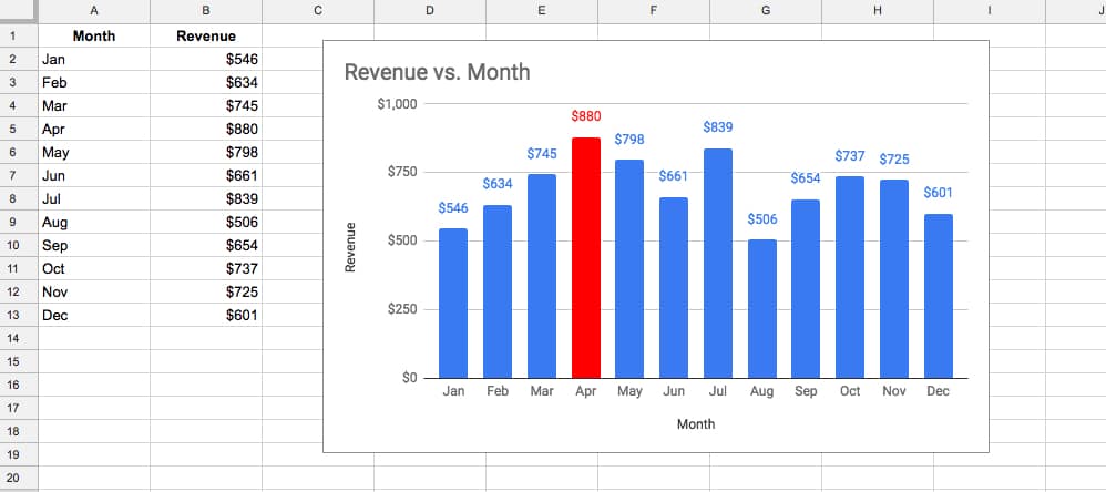
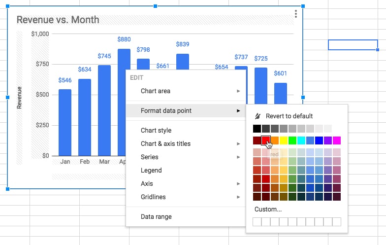
This data point is added under the Series menu in the Chart Editor sidebar, so you can specify unique formatting. For example, I’ve formatted the largest revenue month in red in the following chart:
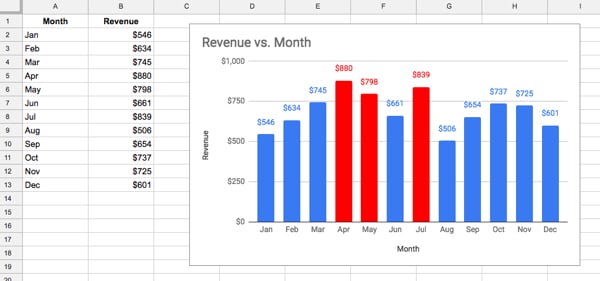
It’s possible to add multiple data points to be formatted (and each can be uniquely formatted):
Note, custom formatting can be applied to individual data points by right clicking them from within the chart:
How to add labels to specific data points only?
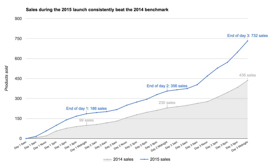
In the example below, I used data labels to clearly indicate the sales figures for the end of each day, during a 3-day digital flash sale, which helped the client easily see their performance.
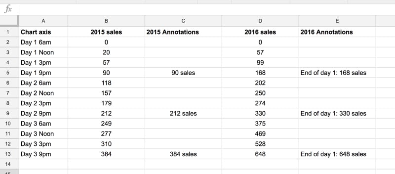
Let’s start with this dataset:
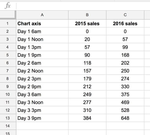
which records the number of products sold during a 3-day sale.
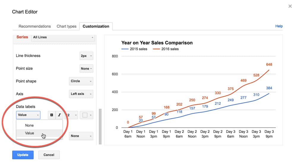
If you plot a default line chart and add data labels in the Chart Editor, you’ll notice you have no choice of their placement; it’s all or nothing, as shown in this image:
So, we need an alternate approach.
Annotation columns
The trick is to create annotation columns in the dataset that only contain the data labels we want, and then get the chart tool to plot these on our chart.
Add annotations in new columns next to the datapoint you want to add it to, and the chart tool will do the rest. So if you set up your dataset like this:
then the chart tool will interpret those annotations and add them to the correct points on your chart:
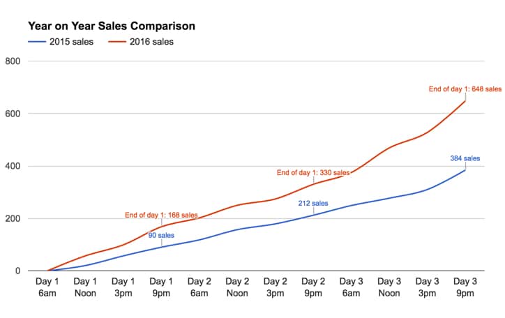
Note, you’re not restricted to text in these annotation columns. In this example the formulas in columns C and E are respectively:
=B5&" sales"and
="End of day 1: "&D5&" sales"Can I see an example worksheet?
How do I add data labels to only the last datapoint of my series in Google Sheets?
Using exactly the same technique as illustrated above, you can label the last points of your series. You can do this instead of a legend and, in many cases, it can make your charts easier to read, as your viewer’s eye doesn’t need to scan back and forth between the series lines and the legend.
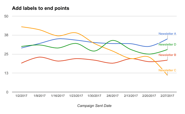
The dataset to create this effect is as follows:

Hello:
I’ve noticed that you have a variety of articles explaining how to use Google sheets charts. Here is a question I have concerning financial data.
I often see individual stock prices charted by – Low 52 week price -todays price- high 52 week price. I can get all these values but am stumped by how they get them in a live horizontal bar or line chart showing those 3 points. I can find nothing on the internet explaining how this can be done.
Do you have any thoughts on this type of graph?
Thank you
Jim
Hi, I m trying to use annotations in my work. It’s not working as you mentioned above. Could you help
The section titled “How to add formatting to individual data points only?” is very helpful… however I only got about 1/4 of the way into my dataset and I reached the bottom of the list, where it abruptly says:
There are more items than can fit in the menu
Uh… what do I do now? How do I format the remaining points that need to be formatted when they won’t show up in the menu?
What would be even better is if I could add some kind of formatting column in the original data, as it’s rather time consuming to format 30 or 40 points out of 400 or 500.
This didn’t work for me.
The solutions is really simple….all you need to do is add the data labels and then delete the ones you don’t want.
It may take a few attempts to isolate and then delete, but it works, I promise.
Is it possible to remove a data point entirely?
For reference, I have a rolling Task tracker within my team, and tasks move from Open / WIP/ Closed/ Updates by status as they are picked up by the team.
So ideally one column has all this data, but I want a chart that represents all data excluding ‘closed’ data points
Under heading “Annotation Columns”, 2nd paragraph “the chart will do the rest”… no, it definitely will not.
You have to go to your Chart Editor, Setup section. Scroll down to where your series are, and click the vertical elipsis to open the menu for your data series. Click ‘Add Labels’, your label series will be auto-populated with the horizontal axis values (some quick testing tells me). Simply replace this data range with the annotations data range by clicking on the range, clicking on the box to the right (with the tooltip ‘select a data range’), then selecting your annotations range in your sheet.
As you can see, these steps ARE NOT ‘done by the chart’ for you. Skipping this step in the guide leaves a big hole in the process. I hope that helps someone.
This was the missing piece I needed. Thanks Aidan
Top article, helped me a lot. Thank you !
One question – can we do labels multi-line in a case the text is long, so the tables won’t overlap each other?