In this post, I’ll show you how to create dynamic charts in Google Sheets, with drop-down menus.
I get lots of questions on how to add interactivity to charts in Google Sheets. It’s a great question that’s worthy of a detailed explanation.
Dynamic charts can really enhance reports and dashboards, allowing for more information to be conveyed in the same amount of screen space. This article will show you how to use the data validation method to make a Google Sheets drop-down menu to control a dynamic chart.
Step-by-step guide to creating dynamic charts in Google Sheets
This article walks through the steps to create dynamic charts in Google Sheets, with drop-down menus so the user can select a parameter, e.g. a sales channel or name, and see the chart update.
It’s a relatively simple technique but surprisingly powerful.
Click here to get your own copy >>
The basic dataset
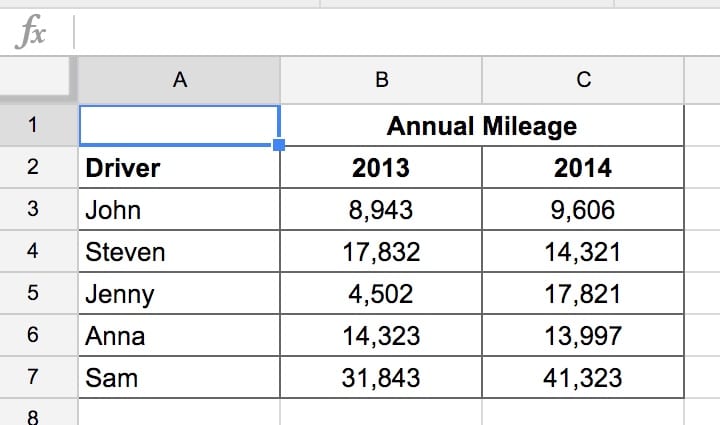
In this example I’ve created a small table showing annual mileages driven by various users:
Creating the drop-down menu
Let’s create a list of choices to present to the user that will control the chart. Here, the user will choose a driver from the list of names and the chart will then only show that driver’s data.
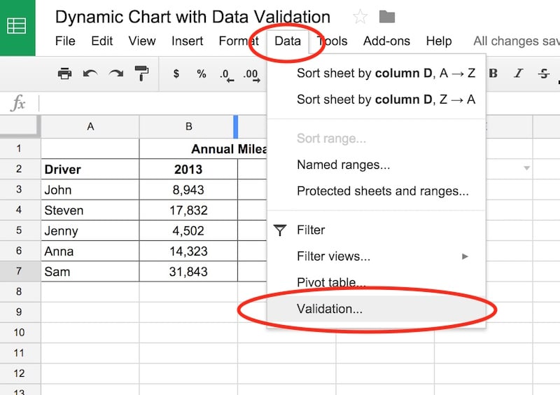
The data validation drop-down menu exists in its own cell, so put it next to the raw data table. I’ve chosen cell E2.
So click cell E2 with your cursor, then head to Data > Validation menu option:
Make sure you have E2 selected as the Cell Range. Then select the range of names A3:A7 as the Criteria, as shown in this image:
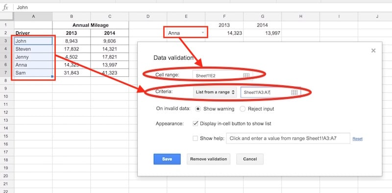
You can leave the other settings as they are.
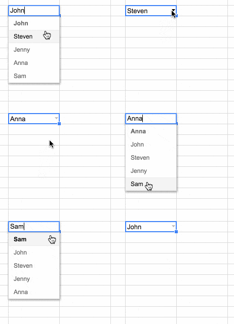
Click save. This will add a small grey triangle to the right side of input your cell, E2. Click on it and you’ll see a user input menu for names:
Now you have the Google Sheets drop-down menu set up, you’re halfway there.
Read more about this technique here: How To Create A Google Sheets Drop Down Menu
Using VLOOKUP to dynamically retrieve data
You want to link your table of data to this Google Sheets drop-down menu, so you can chart the data corresponding to the name we’ve selected.
The amazing VLOOKUP function searches for values and returns data when it finds a match. It combines beautifully with a drop-down menu.
Create a table using VLOOKUPs to pull in the data from the raw data table, using the value in the Google Sheets drop-down menu as the search criteria.
Put these VLOOKUP formulas into cells F2 and G2 respectively:
=vlookup($E2,$A$3:$C$7,2,false)=vlookup($E2,$A$3:$C$7,3,false)Add headings to this interactive table: 2013 in F1 and 2014 in G1.
Create dynamic charts in Google Sheets
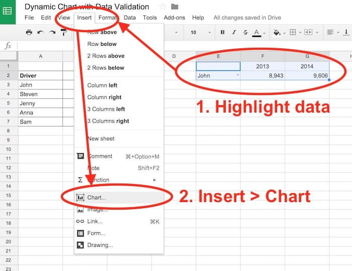
Finally, create a chart from this small dynamic table of data. Highlight the data, then click Insert > Chart menu:
Select a column chart and ensure that Column E and row 1 are marked as headers and labels:
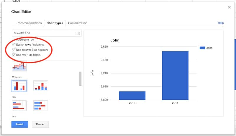
Click insert.
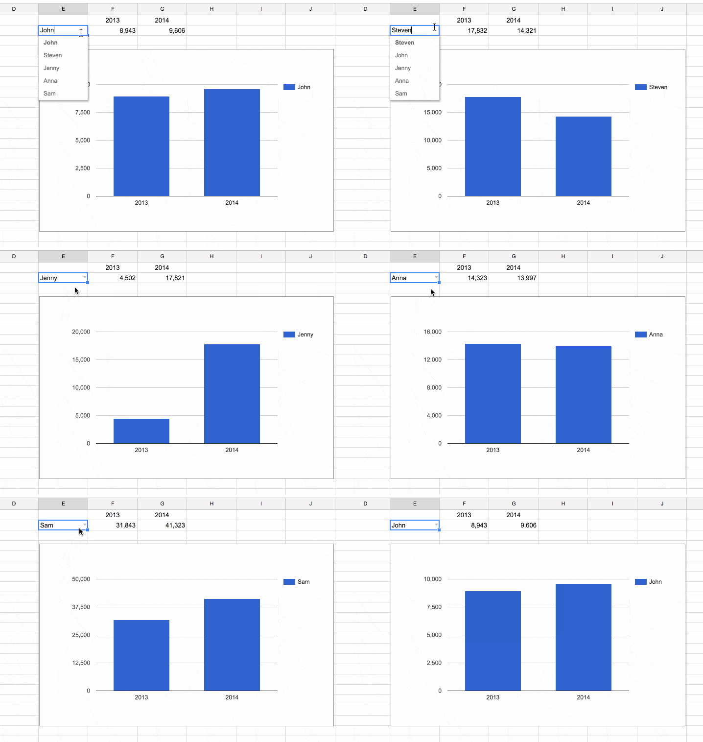
Test your chart.
It should now be dynamic so that it changes whenever you select a new name from the Google Sheets drop-down menu:
Great job!
You’ve now created your first of many dynamic charts in Google Sheets!
Now go forth and make beautiful, dynamic dashboards.
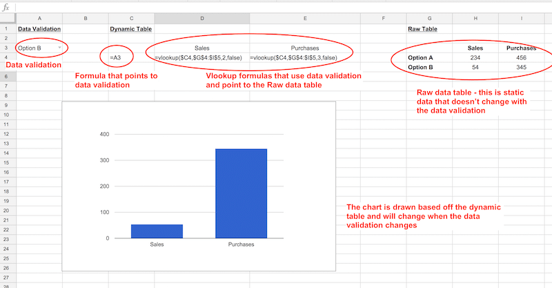
Another view:
Here’s another example showing the steps of this technique side-by-side:
Further Reading
This is one of 10 techniques that can be used to build dashboards in Google Sheets – check out the other nine here.
Create an in-cell dropdown list in the Google documentation.
Hi Ben,
Your articles are great, thank you for all the google sheets help. I’m trying to create my own dynamic dashboard, but am having a lot of trouble because of the complexity of my data. My data is set up like this:
Team, Recruiter, Week, Action ,Target, Actual
How can I create a dashboard to sort by team, and show charts that show the data by week?
Any help you can provide would be much appreciated!
Hey Ben, thanks for the great tutorials, I’m actually trying to setup functionality for a number of dynamic chart, but thought i would start with the easiest first
I would like to setup a drop down list (using data validation) to toggle between different sparkline charts in the same column.
Can this be done?
Cheers
Hi Ben, I can’t believe I solved this! Moving onto some harder ones now. Stay Tuned!
Great stuff! You were too quick for me 😉
Ben – Great stuff here. Let’s say you wanted this to be a stacked bar chart so the default would show “all drivers”. How would you add a filter so that the stacked bar chart would show all drivers when “all” was selected, but just a specific driver when that specific driver was selected?
Do you have an example of how this would work somewhere?
Hey David – you could add a total line to the table and include that in your drop down filter/vlookup/chart. I’ve updated the Google Sheet to show this: https://docs.google.com/spreadsheets/d/15e3PcCZLFcmLiVFEl98e_MPUDzCrmogGQ1wDFd8HdHQ/edit?usp=sharing
Cheers,
Ben
Ben – that was my first thought, too, but it only shows me the total, not each person’s contribution. In other words, the stack (the way you did it) only shows one color for the total. I was looking for one color per driver that adds up the total.
Like in this example: https://docs.google.com/spreadsheets/d/1kcq6JbvmFkMGMqmCTrdWJnm6To4kPWkci4eCodJ9oCw/edit?usp=sharing
Hey David,
I was too quick with my reply! I understand what you mean now. I’ve added an extra sheet to my doc with an example, using IF formulas to handle the logic. I think this achieves the output you were after. Unfortunately the legend shows up with all the names, not just the one selected.
Cheers,
Ben
After creating the drop down menu, and moving onto the next steps, how can the rest be done, if you are taking information from a chart on sheet one and having the charts pop up/drop down in sheet 2?
I created the drop down part on sheet 2, and the next step doesn’t work to get the information from sheet 1
Hey Michelle,
You should just be able to link to the drop cell in sheet 2 by referencing that cell, same as if it was a number in a formula, e.g. say your drop down was in cell A1 then use:
Sheet2!A1Ben
Hello,
Two questions:
1) Is it possible to set this up where you have lots of charts/visuals that all filter via one that drop-down menu? Meaning, if I choose Sam, can I see a pie chart with some data for Sam and a bar graph with different data and a table with still more data for Sam?
2) Do I have to stick with a drop-down menu? Could I use a fill-in box and have people enter a name? I’d rather not show all the names in the database and instead just allow people to look up themselves.
Thanks!
Jill
Hey Jill,
1) Yes, you can just use the same drop-down cell reference in all your various lookup tables (which drive your charts).
2) No, you could remove the drop-down and have them type a name into that cell, which your lookup formulas look to. Bear in mind though, that the name they type would have to match exactly with the name in the data, same spelling, surname or not etc., so it might be a frustrating experience for users unless it’s super clear what format to input their name.
Cheers,
Ben
Is it possible to set the default drop-down value, in my case the date, to the last row that has data besides the date?
If I follow your question, then I think what you’d have to do is create a separate list of the dates that have values, using say the filter function. Then highlight this new list in your data validation.
Cheers,
Ben
Hi Ben,
Thanks for the tutorial.
How can I add drop-down menus to the chart itself? I want to publish it and embed it on my site so users can select values from the drop-down menu without seeing the sheet.
Unfortunately you can’t do that. You should take a look at Data Studio though, it does dynamic charts very well, without users seeing the underlying data. Check out: https://www.benlcollins.com/dashboard/google-data-studio-intro/
Hi Ben! Thanks for the awesome tutorial.
I was hoping that was what i was searching, but unfortunately not at all…
Please, take a look at this sheet:
https://docs.google.com/spreadsheets/d/1_U5C97vvS6udKM_Kt6Xy_Irfvao0W0b7CjHPTPX_Ff4/edit?usp=sharing
I would love to have dynamic charts.
The user will choose the period from the interval X4:AA6 and the charts will update based on those datas.
Another great feature would be to highlight (in the column A) the period that the user choose from the interval X4:AA6
I tried to do that by the conditional formatting, but i’m struggling with that too…
Please help!
Hi Ben, found your tutorial while I was trying to make my chart dynamic. I was wondering if this could be brought further to make a Waterfall chart dynamic in the following sample context:
– Say for instance, I have a fixed quota, A, of my company’s products to produce.
– We need to wait for another department’s input on their support commitment on production, which will tell me how many products we can come up with each month/quarter, and in turn, how long before the quota A will be met.
What I have been able to do up till now, is only create a waterfall chart that will take a variable input of the production support per unit time. I do not know how to make it such that the chart will take this input, and extrapolate the time needed to hit the quota A.
Any way this is doable?
Hi Ben – do you know a way to create a google chart that automatically pulls in added data? For example, if I have a chart pulling from the series A1:A10, but every month , week, day etc. I add a line, is there a way the chart can automatically include new data? Meaning it would include A11, A12, etc.
Thank you for this tutorial! I’m trying to do something similar in Google Slides, but uncertain if this approach will work in Slides as I don’t know that I can display a drop down menu. Do you have any thoughts on how to extend this to Slides?
here is an issue i’m having with this. The chart wont auto-scale. My x-axis (time) data stays the same, however my y-axis data some has ranges like 10,000-60,000 and 350,000 to 400,000. It’s not practical to look at this data when the y-axis ranges is always 0-max y data. Can you set your y-axis data to something like “min y data – max y data”?
James / Ben – same question exactly, any ideas Ben?
This is such a helpful video. Thank you.
But I need now someone to help me with my google sheet. it’s so frustrating. I already got the right formula from this video but it doesn’t match to the next row. this is the formula I want to drag down =VLOOKUP(D5,S1:T3,2,FALSE). But as I dragged it down it changes to =VLOOKUP(D6,S2:T4,2,FALSE) , =VLOOKUP(D7,S3:T5,2,FALSE) and i don’t that coz I want it to be like
=VLOOKUP(D5,S1:T3,2,FALSE)
=VLOOKUP(D6,S1:T3,2,FALSE)
=VLOOKUP(D7,S1:T3,2,FALSE)
=VLOOKUP(D8,S1:T3,2,FALSE)
=VLOOKUP(D9,S1:T3,2,FALSE)
=VLOOKUP(D10,S1:T3,2,FALSE)
though I can do it manually but I need it to be done automatically as I drag it down. Please help me. Thank you
Hi This is good, but if i want to select all the names from dropdown, then how i will do? Please help
Thanks a lot Ben. Your videos are so helpful. It makes me think in different perspectives and tells the reason why some formulas doesn’t work. Thanks again. you are doing a great job.
You’re welcome! Thanks, Minu.
Hi Ben!
Is there a way to make a dynamic chart but make it from a certain date in an excel on?
I don’t want to just highlight a range because as I add rows of interformation I don’t want that to exclude information that I need to be included.
Thanks!
Hi Ben,
Thanks for all the great resources. I have made some dynamic pie charts. I have data coming in via a Google Form. I have created dynamic charts based on the department or grade level that is submitted. I am looking for some consistency of the color that is chosen for a response, but what I am finding is that the pie chart assigns colors to data based on the order they are in the spread sheet. I have attached a copy of my sheet here.
https://docs.google.com/spreadsheets/d/1iyRKfqkDV_f90e4RtfW9LcZSobsG5-GMd7uEXu_27rE/edit#gid=376805188
Any idea if this can be changed. Each time I choose a new grade level or department I’d like the colors to stay consistent. Thanks for any input you have.
Andy
Ben,
I’ve learned so much from your tutos, THANK YOU !
Is there a trick to make the title of a chart refer dynamically to a cell value. This feature should be quite basic but strangely the titles become even after a first time import from the data range.
thanks,
m.
Looking for answer to this question also.
Also looking for this. Dynamic Chart Title.
Unfortunately, you can’t link the titles in Charts to cells, so you’re stuck with static text. You can always remove the chart title and use the cells above the chart to display a dynamic title. Not ideal, but a workaround.
Cheers,
Ben
I barely know how to do scripts but I copied and pasted this one and it worked nicely to update the chart title to a selected cell. You do have to select the cell and then run the script from the “Chart” item added to the top nav. But this is pretty simple. I wanted a dynamic title that changed based on filtered data.
https://webapps.stackexchange.com/questions/114561/set-title-of-currently-selected-chart-from-named-cell
Dear Ben,
I’ve learned a bit something new here, THANK YOU !
Thanks for the great start I had with you . I have made a drop down menu. I have data coming from the data validation created. I have created drop down menu based on a nominal roll for security guard that I worked with. I am now trying to do vlookup to get the status as active or inactive with the total for each position, but what I am experiencing is that the formula assigned to get the value is not evaluated based on the order they are in the spread sheet. I have attached a copy of my sheet here the error part is highlighted in red.
https://docs.google.com/spreadsheets/d/1MvhdQKc2O9EVsw_S0-nGmxzwsKKJJjTYGus2OARpKfc/edit#gid=1809936628
Is there a way, so that I can link these dynamic charts to my website? Also can we do the same, using android Google spreadsheet app? I can created a dynamic chart using android app, but I’m finding a way to share it! One can share entire spreadsheet using attribute, but what if one wants to share specific column/row/dynamic chart!!
Thank you so much. Its amazing how clear is this tutorial. You are the best.
hi, can you please tell how to create a dynamic date that would change every month on the same date. e.g 8/8/2020 (DD/MM/YY) should change to 8/9/2020 on 8th of September.
Thanks Ben for the tutorial. But my chart shows no data.. Can you help!
This was easy to understand and exactly what I needed, thanks.
This is hugely helpful, easy to understand, and still works in 2024. Thank you.
You’re welcome! Cheers