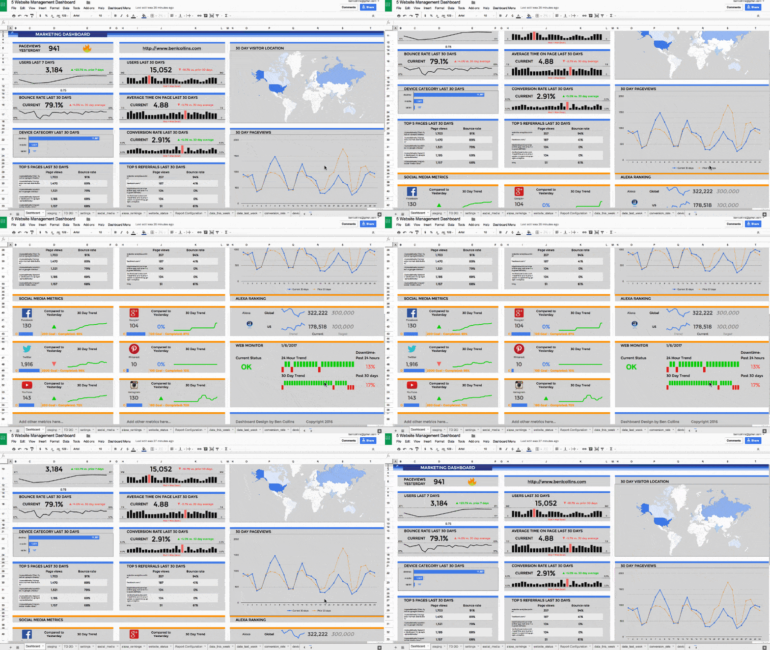
You’re probably familiar with using Google Sheets to organize and analyze your data. But did you know you can build a dynamic Google Sheets dashboard to really understand your data?
With a handful of powerful techniques, you can add some pizzazz and dynamism to the presentation of your data. Here are ten tricks to try next time you’re building a Google Sheets dashboard.
 💡 Learn more
Learn more about dashboards and working with data in the Build Dashboards with Google Sheets course
Contents
- Collect user inputs through a Google Form into a Google Sheets dashboard
- Retrieve data with LOOKUP formulas
- Apply logic with conditional formulas
- Automate your dates
- Add interactivity with data validation
- Chart your data
- Show trends with sparklines
- Apply conditional formatting to show changes
- Format like a pro!
- Share and publish your dashboard for the world to see
1. Collect user inputs through a Google Form into a Google Sheets dashboard
Google Forms are a quick and easy way to collect data. The responses are collected in a Google Sheet which we can then use to power a dashboard. For example, you could run a survey on customer satisfaction, or status reports from your operations team members, and then turn this data into a one page visual summary, giving you instant insight into your data. Let’s run through a super quick and simple example:
Step 1: Create a Google form
Create a Google form in Google Drive (detailed instructions here) by navigating to:
Drive > New > More > Google Forms
Step 2: Setup the form
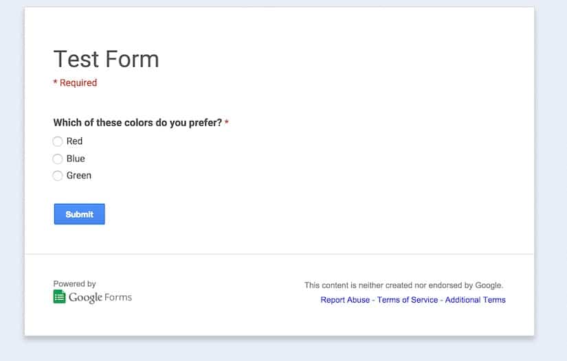
Next, setup your Google Form by giving it a name and adding any questions that you have. In this example, I’ve created a form with one multiple choice question which asks a user which color they prefer (from red, blue or green):
Step 3: Create the Google Sheets dashboard
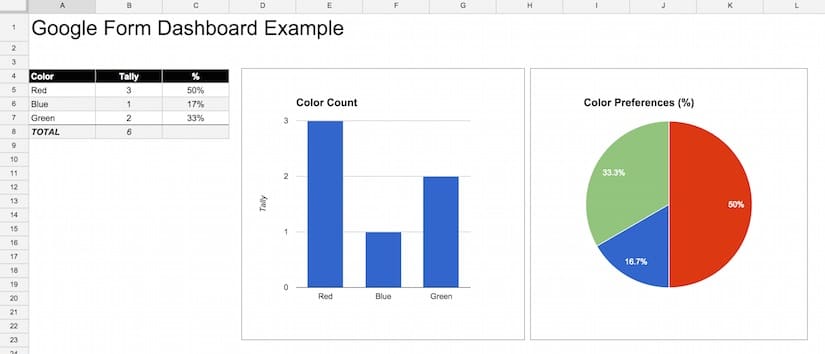
View your responses and setup the Google Sheets dashboard. You’ll need to submit the form at least once, so that you have some data in your responses which you can use. I then added a new tab and created a new table (a staging table), which uses a countif formula (see section 3 on conditional formulas below) to tally up the votes for each color and show this count in the staging table. Then I added a bar chart and pie chart (see section 6 on charts below) running off this staging table to display the counts visually. These charts will update whenever new votes are submitted.
2. Retrieve data with LOOKUP formulas
Mastering lookup formulas is a key technique for many data projects in Google Sheets (and Excel). It’s at the heart of the Google Sheets dashboard shown at the start of this post and such a useful technique in it’s own right that I’d recommend investing time to practice this technique. There are several methods at your disposal:
The VLOOKUP function is a vertical lookup formula which searches the first column of a range, and when it finds the first instance of the result (if there is one), it returns the value in that row from the column of the range that you specify with the index value, e.g.:
=VLOOKUP(F1,A1:D20,4,FALSE)This formula takes the search term in cell F1, for example a string “Channel A”, and looks for it in column A. At the first match, if it exists, (e.g. imagine cell A10 contains “Channel A”) it returns the value corresponding to column 4 of that same row (in this case D10, which might be a sales figure for Channel A). Searching through numeric or dates in your lookup column (the first column) requires the data to be sorted to avoid incorrect values being returned.
The HLOOKUP function (covered on Day 9 of my free Advanced Formulas 30 Day Challenge course) is a horizontal lookup implementation of the vlookup formula. I find it’s rarely used but useful to keep in the back pocket for certain specific situations.
The INDEX function & MATCH function (covered on Day 10 of my free Advanced Formulas 30 Day Challenge course) are two formulas that combine together to create powerful, flexible lookup solutions. They are superior to vlookups by being more flexible. However, they are a little more complex to implement as they involve two nested formulas.
To create the same implementation as we had above with the vlookup, we could use this formula:
=INDEX(A1:D20,MATCH(F1,A1:A20,0),4)Multi-condition lookup formula: Sometimes a simple lookup formula isn’t enough. For example, you may need to find a result based on two or more parameters (e.g. web traffic from a specific channel in a specific month). In this case, a multi-condition lookup formula can do the trick.
Say we have this table of Google Analytics data and need to retrieve the number of Search results in January 2015 (i.e. our answer is dependent on three criteria):
| A | B | C | D | |
| 1 | ga:year | ga:month | ga:channel | ga:sessions |
| 2 | 2015 | Jan | Search | 46,936 |
| 3 | 2015 | Jan | 922 | |
| 4 | 2015 | Jan | Referral | 4,973 |
| 5 | 2015 | Feb | Search | 43,302 |
| 6 | … |
Let’s assume we have setup a staging table for our charts below this. To lookup the value we want (in this case Search for Jan 2015):
| 9 | … | |||
| 10 | Year | Month | Search | |
| 11 | 2015 | Jan |
Formula?
|
|
| 12 | 2015 | Feb |
Formula?
|
we can use this formula in cell C11:
=INDEX($D$2:$D$9,MATCH($A11&$B11&C$10,$A$2:$A$9&$B$2:$B$9&$C$2:$C$9,0))which gives a result of 46,936.
Crazy huh!
This formula uses an index/match lookup to compare multiple values across multiple columns in a data table. It concatenates the year, month and channel, to use as the lookup value, then looks for this concatenated value in the raw data across the year, month and channel columns. When it finds the right match it returns the corresponding result.
3. Apply logic with conditional formulas
The COUNTIF function counts items in a range that match the specified criterion. It’s useful for doing things like counting non-blank cells in a range or counting the number of specific items in a range. The formula is:
=COUNTIF(range, criterion)
The COUNTIFS function is similar to the COUNTIF formula but returns a result based on multiple criteria. In other words, it counts the number of items in the first range that matches the first criteria AND also match a second criteria in a second range AND a third etc… The formula is slightly different to the basic countif formula, as follows:
=COUNTIFS(range1, criterion1, [range2, criterion2, ...])The SUMIF function is the same idea as the countif, but returns a sum of the values. It’s possible to match criteria in one range, but sum values in a separate range, which is a really useful feature (e.g. imagine a table with names in column A and sales results in column B, then the sumif formula can sum the sales values for all occurrences of say “Ben” from the list of names). The formula for sumif is:
=SUMIF(range, criterion, [sum_range])
The SUMIFS function is the multi-criteria version of sumif, so it’s the same idea but the sum is calculated when you match multiple criteria in multiple ranges. Again, a very useful formula:
=SUMIFS(sum_range, range1, criterion1, [range2, criterion2, ...])4. Automate your dates
Dashboards often have a date component to them, where a variable changes over time and merits being illustrated visually in the dashboard. There are various formulas/techniques available for automating this process.
The today formula, which gives the current date, will display the date the last time the spreadsheet was recalculated (for example, when you open it or make a change). The formula is:
=TODAY()If you want to also have a current time element in your spreadsheet, then use the now formula, which returns the date and time the spreadsheet was last recalculated. The formula is:
=NOW()Both the today and now functions can be set to update automatically, rather than just when the sheet is recalculated. Go to File > Spreadsheet Settings and then select “On change and every hour” or “On change and every minute”.
Be careful of inserting too many of these formulas in your spreadsheets as they are volatile functions, which means all that recalculating will harm your spreadsheet performance.
An example of using the today formula would be to display the current month in your dashboard, using the following text formula:
=TEXT(TODAY(),"MMMM")For a more complex example, think of setting up start and end dates for a dashboard table, where I could enter formulas using the today function, set it to update automatically, and then base the other dates off that, using formulas.
The EOMONTH function comes in handy here, returning the last day of a month which falls a specified number of months before or after another date.
For example, use the following formula to create the first day of the month prior to the current one:
=EOMONTH( TODAY(), -2 ) + 1I could then keep “rolling” the months back, by changing the “-2″ to “-3″ for two months prior, then “-4″, “-5″ all the way back to “-13″, to give the current month plus 12 preceding months in a table, which would automatically update as we move into each new month.
I could also get the first day of the current month but a year earlier, for example to compare current sales metrics against the same period last year, using the following formula:
=EOMONTH( TODAY(), -13 ) + 1See also:
> How do I get the first and last days of the current month?
> How do I get the first and last days of the prior month?
There are many possible variations from combining today, date, text and eomoth formulas, to get the correct periods you want in your Google Sheets dashboard and have them update automatically to stay current.
 💡 Learn more
Learn more about dashbaords and working with data in the Build Dashboards with Google Sheets course
5. Add interactivity with data validation
Use data validation to add interactivity to your dashboards. You can create a nifty drop-down menu from which the user can select a parameter, e.g. a sales channel or specific time, and then change the data based on this choice, so any charts will update automatically. It’s a pretty simple technique but surprisingly powerful.
First, create a list of choices to present to the user, e.g. list of sales channels, and then using the Data > Validation feature on the highlighted list of values, create a user input menu for sales channels:
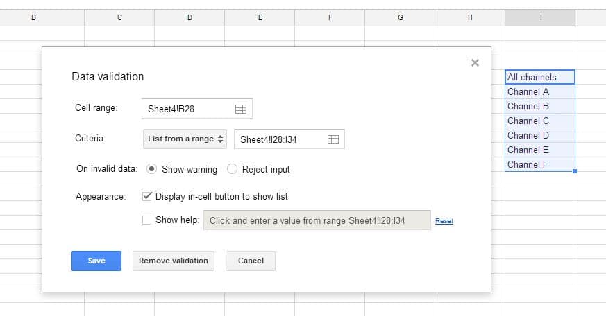
The user then has a drop down menu in your spreadsheet, from which he/she can select the desired parameter:
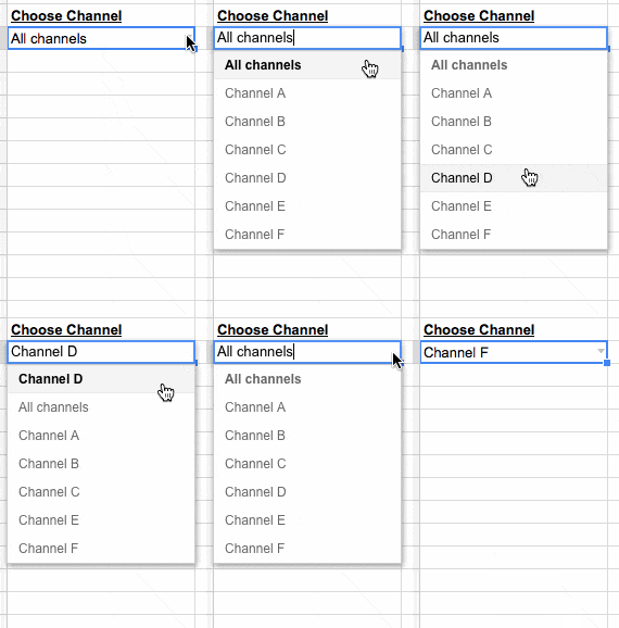
Data in the table which underpins a chart is changed based on the user’s choice from the drop-down menu above, by using one of the lookup formulas from step 2.
Further reading: Check out this article and YouTube video on how to use data validation to create dynamic charts.
6. Chart your data
Google has a whole suite of charts available to use with your data. Some of the most well-known is the plain old bar/column chart, the much-maligned pie chart (personally, I think judicious use is ok), line charts and scatter plots. In addition, though, Google Sheets has the ability to create map charts, interactive time series charts, gauges (can be useful if used judiciously), or combined “combo” charts, which allow you to combine different data series visualizations.
Examples
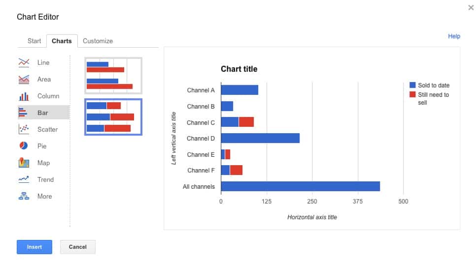
The humble bar chart can be tweaked into a stacked bar chart, which can be used to visualize two related metrics, for example how many sales have been made so far, versus how many are still required to hit the target.
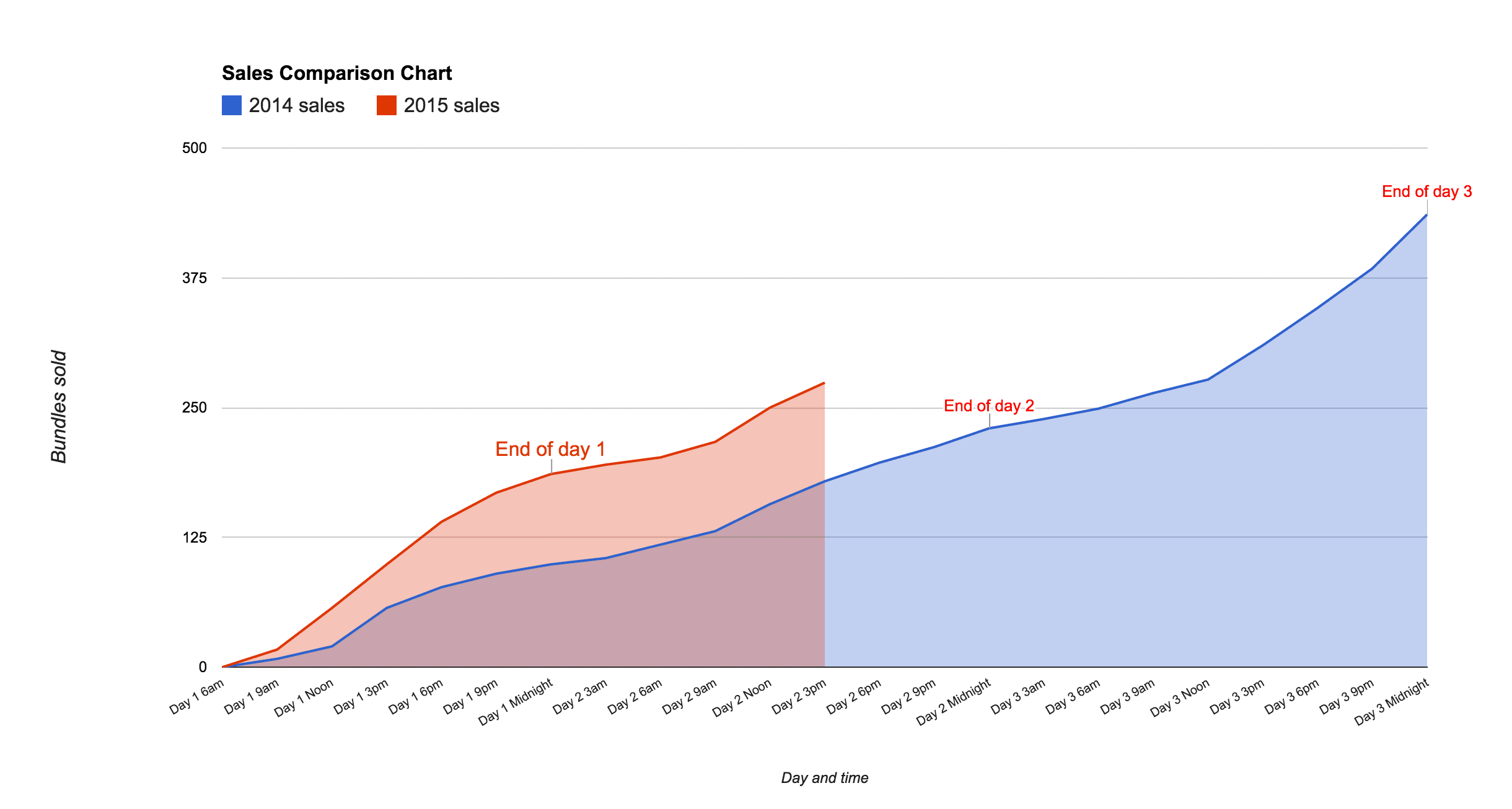
An area chart can be used to show comparisons of data, as shown in this example of the cumulative sales during a digital flash sale, showing 2014 data against 2015 data:
More info on setting up charts in the official docs here.
7. Show trends with sparklines
Sparklines were first created by statistician and data visualization legend Edward Tufte. They’re small, simple charts without axes, which exist inside a single cell. They’re a wonderful, quick way for visually showing a result, without needing the complexity of a full-blown chart. They work well for datasets based on a timescale.
A sparkline looks like this:
The formula for sparklines in Google Sheets is:
=sparkline(data,[options])where data refers to a range of values to plot the sparkline. The optional options argument is used to specify things like chart type (line, bar, column or winloss), color and other specific settings.
Further reading: Everything you need to know about sparklines in Google Sheets
8. Apply conditional formatting to show changes
Hidden in the Custom Number Format menu is a conditional formatting option for setting different formats for numbers greater than 0, equal to 0, or less than zero.
It’s a great tool to apply to tables in your Google Sheets dashboards for example, where the data is changing. By changing the color of a table cell’s text as the data changes, you can bring it to the attention of your user.
Consider the following sales table which has a % change column:
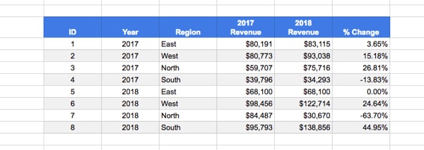
Now take a look at the same table with colors and arrows added to call out the % change column:
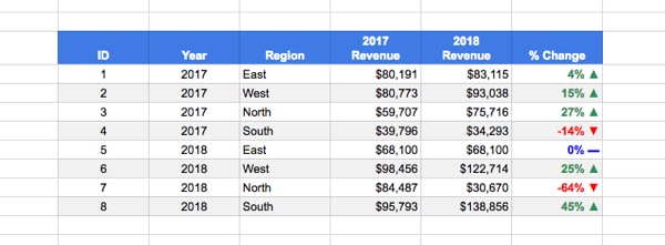
It’s significantly easier/quicker to read and absorb that information.
How to add this custom formatting
1. Somewhere in your Sheet, or a new blank Sheet, copy these three CHAR formulas (you can delete them later):
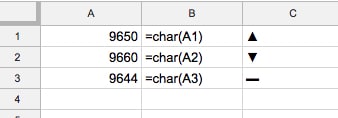
=char(A1)=char(A2)=char(A3)Now, copy and paste them as values in your Sheet so they look like column C and are not formulas any longer.
(You copy as values by copying, then right-clicking into a cell and select Paste special > Paste values only…)
You’ll need to copy these to your clipboard so you can paste them into the custom number format tool.
2. Highlight the % column and go to the custom number formatting menu:
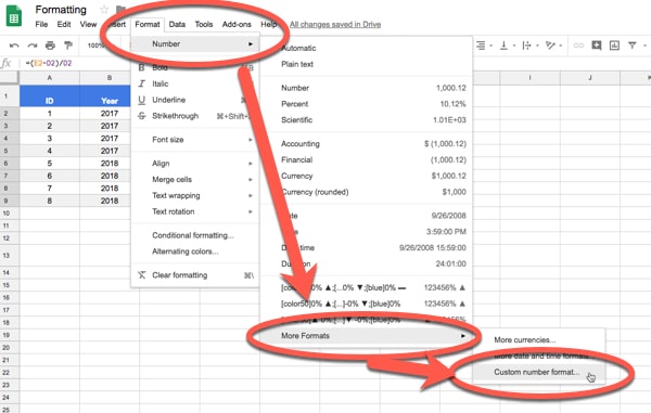
3. Change the 0.00% in the Custom number formats input box to this:
[color50]0% ▲;[color3]-0% ▼;[blue]0% ▬as shown in this image:
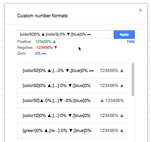
What you’re doing is specifying a number format for positive numbers first, then negative numbers and then zero values, each separated by a semi-colon.
Copy in the symbols from step 1 (you’ll have to do this separately for each one).
Use the square brackets to specify the color you want e.g. [color50] for green.
Read more about custom number formatting here.
9. Format like a pro!
After all that effort to tease out the real stories hidden in your data, and make them accessible in charts and tables, it’s worth a little effort to spruce up the final version. Consider some of these ideas:
- Change the color of charts in your Google Sheets dashboard to match your brand
- Give all the tables a consistent format, e.g. light gray borders, a bold header row with white text and alternate colors for the rows
- Remove the gridlines. Find this option in the View menu:
View > Gridlines - Add your logo to the top of the dashboard
- Hide all working tabs except the dashboard tab (does not affect the functionality of the dashboard)
- Use freeze panes, to lock specific rows or columns, so that if a user scrolls the header row(s) will be locked in place for example, and the title and user input options will always be visible. It’s found in the View menu:
View > Freeze - View the dashboard in full screen mode
10. Share and publish your Google Sheets dashboard for the world to see
It’s quite likely you’ll want to share your dashboard with colleagues, clients and/or the world. There are a couple of ways of doing this.
Firstly, you can click the Share button in the top right corner of the screen, which opens up the sharing options pane:
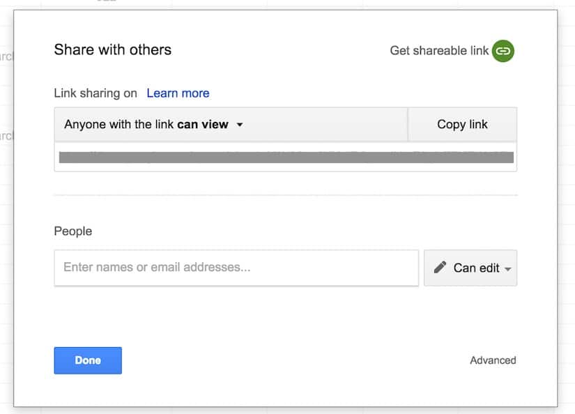
From here, you can enter email addresses to share directly with colleagues, or you can grab the sharing url and email that to people you want to share with, or paste it into social media channels.
You have control over the access rights and whether recipients of the link can view, comment on or edit the dashboard. More information on the sharing settings in Google sheets here.
Secondly, you can publish your Google Sheets dashboard as a web page, or embed it as a component in another page, by clicking on:
File > Publish to the web...
which brings up this pane of options:
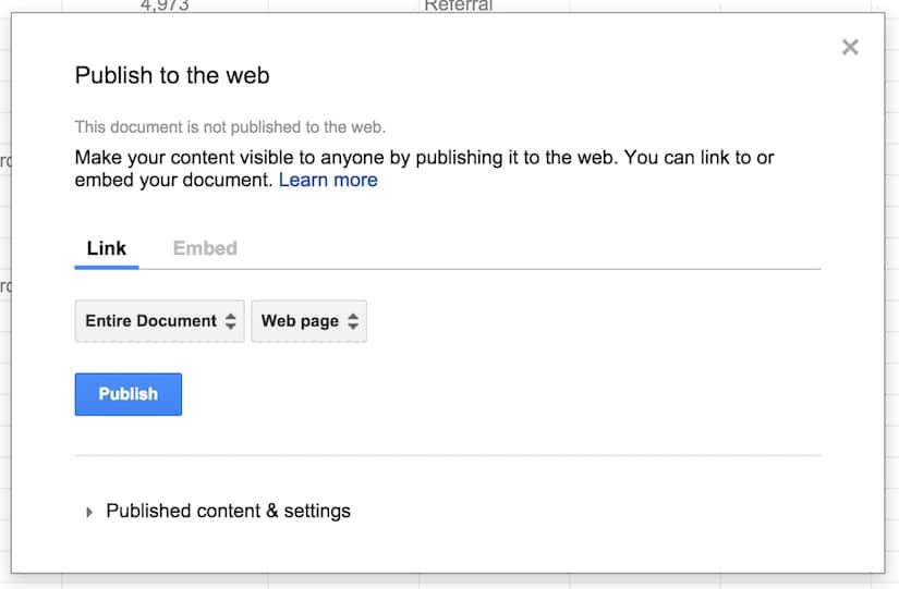
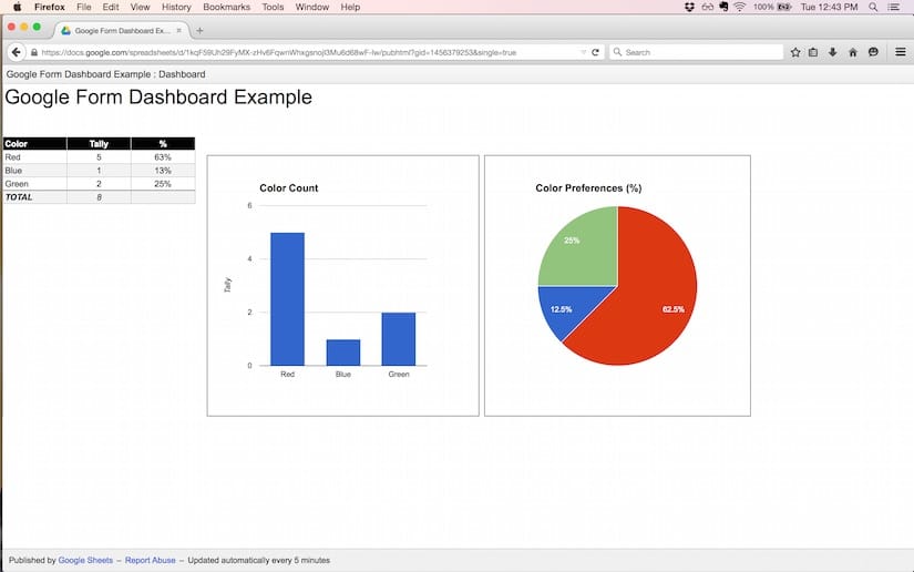
Publishing this way makes the Google Sheets dashboard visible to the public. For example, here is the Color Picker Form dashboard example from section 1 of this post, published online as a web app:
Grab the Google Sheet template for this Google Sheets Dashboard tutorial, with all 10 examples!!
Click here to get your own copy >>
Thoughts or comments? Do you have a favorite technique or formula for dashboards? Leave your ideas below!
 💡 Learn more
Learn more about dashbaords and working with data in the Build Dashboards with Google Sheets course

Hello Ben,
I am so glad to have found this article on web. this is so helpful me to groom myself. Being novice business analyst at a startup, i was struggling to make dashboards on excel. After 2 months of self learning i manage to create dashboards with slicers on Win excel 2013, which sadly could not run on managers Apple PC (because of absence of slicers features on Apple PC),
I have to now transform every thing on a common platform like google sheets. was worried about how do i start with limited time in hand.
Your article will definitely help me with a great start. but i am still wondering for other ms excel features if present on google sheets like dependent drop box. well i will have to dive in to learn more.
Thanks for your help,
Reynold.
Thanks Reynold, glad this helped! Feel free to post any specific questions here and I’ll see if I can help.
Ben, great article with some great ideas. Thank you! My question is regarding SPARKLINE and if it’s possible to use an array in conjunction with it (I am just getting baptized in all the greatness of Sheets and don’t really know the lingo). My intended outcome is to have a SPARKLINE column chart at the end of each row of data (I imported my data using IMPORTRANGE from a Form Response Sheet and it will frequently update). Is there a way to have SPARKLINE applied to each row of data that is imported or would I have to manually set that up?
Thanks John. One way to do this would be to simply have the sparkline formulas all set up in advance, in the column next to your imported data.
For example, say you were importing your data into columns A through D with headings in row 1, then I would add the following formula into cell E2 (i.e. the column at the end of your imported data):
=if(isblank(D2),””,sparkline(data,[options]))
Then simply copy it down, way past your current last row. It’ll be blank until you import data and then it’ll create a sparkline for you. Basically it tests whether the cell is blank and creates a sparkline if it finds a value.
Hey John,
If you’re interested in sparklines, then you might enjoy this super detailed post I wrote on the subject recently: https://www.benlcollins.com/spreadsheets/sparklines-in-google-sheets/
Cheers,
Ben
Hi Ben,
Could you show how to graph last 12 months sales figures using today’s date as input?
Many thanks!
Neeti
Hey Neeti,
This is a rather general question so it’s difficult to give specific advice, but he’s a few tips that might help:
You’ll want to have sales as your vertical y-axis and time series as your horizontal x-axis in your chart. So you’ll need this data in two columns, then you can select it and insert a column chart.
If you want to group the data into months first, then use this formula:
=month()to extract the month for each date in your dataset, then create a pivot table of your data with Months as row headers and sum your sales values (this will aggregate the data), before creating a column chart as before.Some other formulas that might help:
To get today’s date use the formula
=today()Then, assuming today’s date is in cell A1, use this formula to get the same date but one year ago:
=date(year(A1)-1,month(A1),day(A1))You can extract your sales dataset based off today and this date one year ago.
Hope that helps!
Ben
Hi Ben,
This is really great! congrats!
I’m looking to move away from Microsoft PowerPivot, but I cannot get the great functionality slicers provide. I can see how your data validation is very close to it, but I don’t think it is slicing data to the level I need. I use that to build segments of users.
Do you have any suggestion on how to better achieve this?
Hopefully with these tips I can finally get rid of my windows machine and go back to super convientent for all web work macbook.
Thanks
Thanks Albert!
Hmm, sounds like you could use multiple data validations to achieve this. So the first drop-down lets you select a category, which creates an intermediary list that is used in the second data validation list. Here’s a quick demo I made (click the link, then make your own copy File > Make a copy… to see the functionality): https://docs.google.com/spreadsheets/d/1X3nkMEe9hgKTkBD3_ksl7Tiak8kYDRSGlQ71yhX5xyE/edit?usp=sharing
Thanks Ben!
Awesome Ben!! Beautiful work. Thank you for the information, very useful and very clear. I have only one Q’? Do you think is possible to create a very simple tracking tool, could be “embedded” or a “public HTML”, that uses the Google Sheet as a database and makes possible to give someone information based on a specific number they search for? Like a search query. Something similar to Fedex or UPS when you “track” a shipment. You search for a number they’ve given you, and with this number you can see the “status” of a process. Is something I think is possible, but just don’t know how to easily make it!!! thanks
This page really has all of the info I wanted concerning this subject and didn’t know who to ask.
Hi Ben,
Really appreciate your work here! It would be very great if you take some time to look at our problem belew and maybe provide us some guidance.
We have already used dashboards in Google Sheets for a year in our startup, but when the data got in to more than 100,000 rows we struggled to work with the sheets.
To be specific, we import raw data into a separate spreadsheets (we call this function spreadsheets) where we perform lookup and calculation, then export them to new ones for reporting. The problem is that now the function spreadsheets get too large and take a long time to load, sometimes they crash. I had some pop-ups in my head that told us to migrate our data into an ‘actual’ database (we prefer open-source ones like MySQL) for scalable practices. However, I have two unanswered questions:
1. How can we still build dashboards in Google Sheets with our new MySQL database without importing data (because if we import then we solve nearly no problems here). Our analytics team has been familiar with Google Sheets.
2. If we shouldn’t create dashboards with Google Sheets when our data has grown big, what are our alternatives that are free and ‘open-source’-like. We prefer to take time over money.
I know that I am asking quite much, but I myself struggle with the problem for nearly a month! Thanks very much and really sorry for any inconveniences.
Hey Quy,
Yes, it definitely sounds like you’ve reached the point of needing a database!
You’ll want to migrate all of your data into the MySQL database and then connect your Google Sheet to the database. You can write SQL statements to then retrieve only the data you want to show in your Google Sheets or dashboards, which should solve the performance issues.
However, connecting Sheets to MySQL is not a trivial exercise and involves some coding in Apps Script. This seems to be the best resource I’ve found: http://www.mousewhisperer.co.uk/drivebunny/connecting-to-mysql-databases-using-apps-script/
(Alternatively, you could use a service like Zapier, but then you’ll be paying for something which you want to avoid.)
In terms of open source dashboard tools for MySQL direct, there are some tools out there of varying degrees of skill level. I haven’t used any that connect with MySQL though, so don’t have any specific recommendations there. If you don’t mind your dashboards living in the open on Tableau servers, then Tableau Public is free and as powerful a dashboard tool as they come.
Hope that helps!
Cheers,
Ben
Thanks Ben!
Actually I have spent my recent two weeks writing some Google Apps Script codes to push and pull data between MySQL and Google Sheets. Basically they work, but the best I can do is to, once a day, trigger the raw data spreadsheets to push to as well as make the function spreadsheet pull from MySQL.
However, what we put emphasis on from dashboards is real-time capability, and my solution seems to not capture that. Moreover, we already made use of the Google Sheets built-in Query and Importrange functions to build function spreadsheets, so whatever data in those sheets are exactly what needed for lookup and calculation. Being able to pull those data from MySQL does help with some other issues but not really for building dashboards on Google Sheets…
I’m a fan of Tableau, but to my knowledge Tableau Public does not allow for connection to online database. Our team is discussing on whether they should just import less, it seems like the most possible answer right now …
Again, many thanks for your reply, it helps me a lot and I really appreciate it! Also sorry because I’m not really good at communication in English.
Best,
Quy 😀
Quy – you’re right! It’s been a while since I’ve used Tableau Public and I forgot that the MySQL connector isn’t available on the public version. Can you not set your trigger to run once an hour? Would that be real-time enough?
Thanks for your suggestion, Ben. We have people work in the raw data sheets all day, so a script that runs once every hour would interrupt them for a while, and may cause disorder I suppose. That’s why I originally intend to trigger the script only at midnight.
Maybe it’s time to seriously consider migrating those processes into some modern kind of databases with tailored user input form… Ben, do you think that the only choice I have left is to ask the tech-team to build something like that?
Well, it sounds like it’s worth investigating that route.
Maybe you could import the data into one master sheet hourly, and then have your team work on different sheets using the IMPORTRANGE formula. Maybe that would reduce disruption although I haven’t tried this particular scenario myself.
Cheers,
Ben
Thanks a lot for your suggestion, Ben. Maybe this will help us to work around before the tech-team can provide solid solution!
Try using Appsheet – it will allow you to input data via custom Apps connected to googlesheets and you can migrate them to Mysql later on, or have them both exist in the same App.
I am new to Google spreadsheets, I work with suppliers and restaurant and we are trying to make it easier by digitalizing all of the information. I just need to transfer some basic information onto the spreadsheet, but don’t want to do it manually. Is there someone that can help. The information is always different and their is a certain way we need to input it into our platform via google sheets? Please help!
Hi Ben – Question: When I publish a sheet to the web and embed it into a webpage on WIX I can’t seem to figure out how to format the sheet so the borders won’t show. I see the name of my sheet at the top and published by Google Sheets – Report Abuse – Updated automatically every 5 minutes at the bottom. Is there any way to completely eliminate those? Thanks.
Your course looks great by the way and I love your tips. Thank you!
Hi Ed,
Try these red settings in your iframe code:
<iframe src="https://docs.google.com/spreadsheets/d/************************************************/pubhtml?gid=471022821&single=true&widget=false&headers=false&chrome=false" height="280" width="800"></iframe>More info here in the docs here: https://support.google.com/docs/answer/37579#embed
If that doesn’t work, then I’m not sure there’s anything else you can do, but you could try the forum: https://productforums.google.com/forum/#!topicsearchin/docs/category$3Aspreadsheets
Hope that helps!
I have a dashboard with a lot of charts. I really like the ease of use of Google Spreadsheets. However, my charts seem to move around and not stay put. I want them to be in nice rows and columns and stay that way.
Have you found any way to force the chart to stay inside of a cell? So I can make all the charts the same size and maintain clean lines?
Hey Dan, this is a good question. I sometimes find my charts creep around a little (never by much) but I don’t know of anyway to “lock” them. It’s always been very minor so I’ve just lived with it.
You can use sparklines to create mini charts inside a cell, and you could always make the cell bigger or merge lots of cells together to make a bigger chart if you want. I use this tactic a lot with dashboards.
Cheers,
Ben
Hi Ben,
I’ve learned a lot from this. I was practicing to publish to web option. in the first instance it is worked well, then I changed something in the same sheet, then again i tried to publish to web option. still it is showing same old first page only instead of the second revision.
Can you pls assist me with this,
Thanks,
Mahesh
Hi Ben)
I am glad to find your site, as I’ve found a couple of new things for me.
Publishing on web is one of them. As it solves 1 problem; links begin to be 1-click objects.
But smth disappointed me:
1) if I want to publish only one sheet, which has links to another sheets, it doesn’t work.
As links redirect me to that published page, but not into the SpreadSheet.
I am thinking about whether there is any method to combine “inner” link with “web” link.
Like link, which redirects me into specified sheet in specified document.
2)second pain is about publishing dashboard, as it becomes unchangeable, and all my techniques with dynamic charts, and everything else become useless.
If you have any solutions for this problems, it would be great when you tell me
Hey Alex,
For 1) don’t think there’s anyway you can do that…
For 2) you can share the sheet and lock ranges except for the dynamic controls or you could look into using Google Data Studio.
Cheers,
Ben
Hi Ben,
Awesome tips.
In Section 9 you recommend to play with charts and gridlines to give the dashboard a polished format. Unfortunately it is not possible to remove the border of a chart in gsheet, and this little annoyance conflict in a very big way with a clean dashboard.
Do you have a clever workaround ?
Thanks much,
Marc
Unfortunately not. I agree, it’s annoying!
Ben,
Thanks for the great tips!
On technique #5, after I publish the sheet, the interactivity does not work. The dropdown arrow does not show up.
Is there something that I need to do to fix this?
Thanks!
One way to build web charts from a Google Sheets spreadsheet is to use the RGraph connector. This way you can import the data directly into your webpage and make charts with it (this is the canvas docs page but it applies equally to the SVG charts as well):
https://www.rgraph.net/canvas/docs/import-data-from-google-sheets.html
So long story short… no pivot charts in Sheets? Building them all manually makes sense I guess. I just worry about processing time, but maybe that’s only an Excel thing.
ps. Appropriately, you’re ‘for’ argument for pie charts is a dead link hehe
Hi Ben,
Useful stuff thanks. What is not clear though is how can this all be leveraged and used in a google form.
A google form is use to collect into.
A google sheet is used to process the info.
But, we can use a google sheet to make life easier for the user filling in the form. For example, a conditional field selection and pulling in dynamic data values from a google sheet.
What is not clear yet to me is what in the examples listed above are able to be used in a google form … build it in a google sheet and link the google form to the google sheet for real time look ups, nested questions and all kinds of flexibility and power to fill the gaps of what a google form can do.
Is this correct?
Thanks,
Marc
Hi Ben,
All your tips and tricks have been super useful, thanks a lot!
I published my dashboard to the web and whenever I hover a chart it highlights the area under the mouse pointer and shows a tooltip (this behavior might differ depending on the chart type). However, when the mouse leaves the area, the chart does not go back to its original state: the tooltip goes away (which is good) but the look of the chart remains as if the mouse was still over it (which is NOT good). This is specially bad when an area chart has a semi-transparent color: after repeated hovering, the area ends up with a solid color…
Do you know how to fix this? or at least prevent hovering events whatsoever? BTW, this happens regardless the dashboard is published as a link or embedded in another element.
Thanks in advance,
Luis
How would you do this to show averages of numbers based on categories? For example, if you have a drop-down menu of certain categories, and then want to show the average number for each category in another place on the sheet. How would you tweak the formula to show an average, rather than a total, as you’ve done in your examples? I haven’t been able to find how to automate averages anywhere. This site has by far been the most helpful I’ve found for formatting in general. Thank you so much!